Redefining Digital Engagement for the World’s Most Tech-forward Bank
1
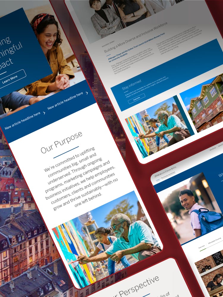
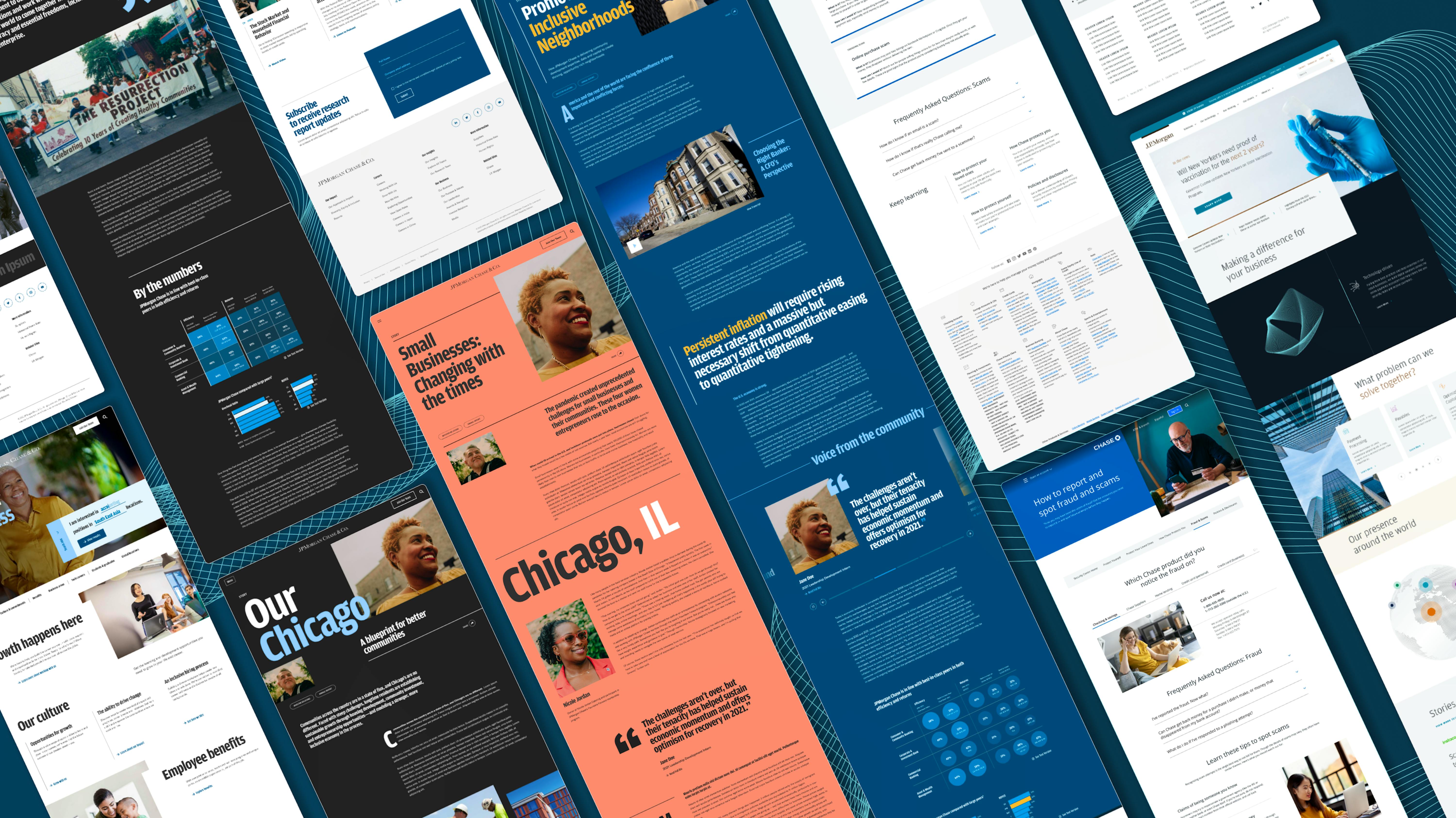
The Background
JPMorgan Chase & Co., the largest bank in the U.S., is an organization dedicated to driving an inclusive economy for communities around the globe and across all facets of its business. They approached Code and Theory to help them align their site to their audiences’ needs, impact marketing objectives, and brand storytelling.
The existing user experience reflected JPMC’s span and size without focus, and the overwhelming navigation and complex site architecture meant users failed to find the stories and actions most relevant to them. JPMC needed to tell a more compelling, organized brand story while attracting top talent — and helping users understand their overall impact and global presence. How could we go about distilling a global financial institution into a digital footprint that served the multitude of audiences and organizational objectives?
Through comprehensive research across the business, user, landscape, and experience, we discovered all audiences had one motivation in common – they came to JPMC.com to learn about the organization and its identity in some form or another. We organized around our insights to create a new site that proves JP Morgan Chase’s story is aligned with the values users care about, enables seamless wayfinding to the content audiences need the most, exposes users to new and important stories, and leads the category in bold, yet inviting, design and brand choices.
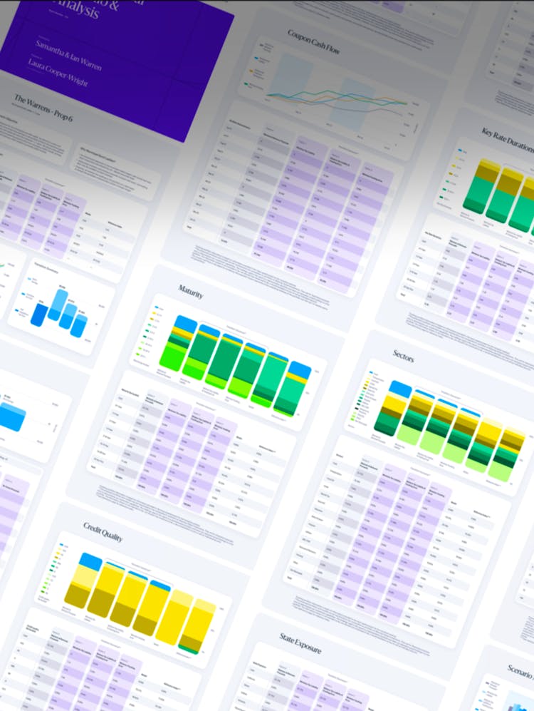
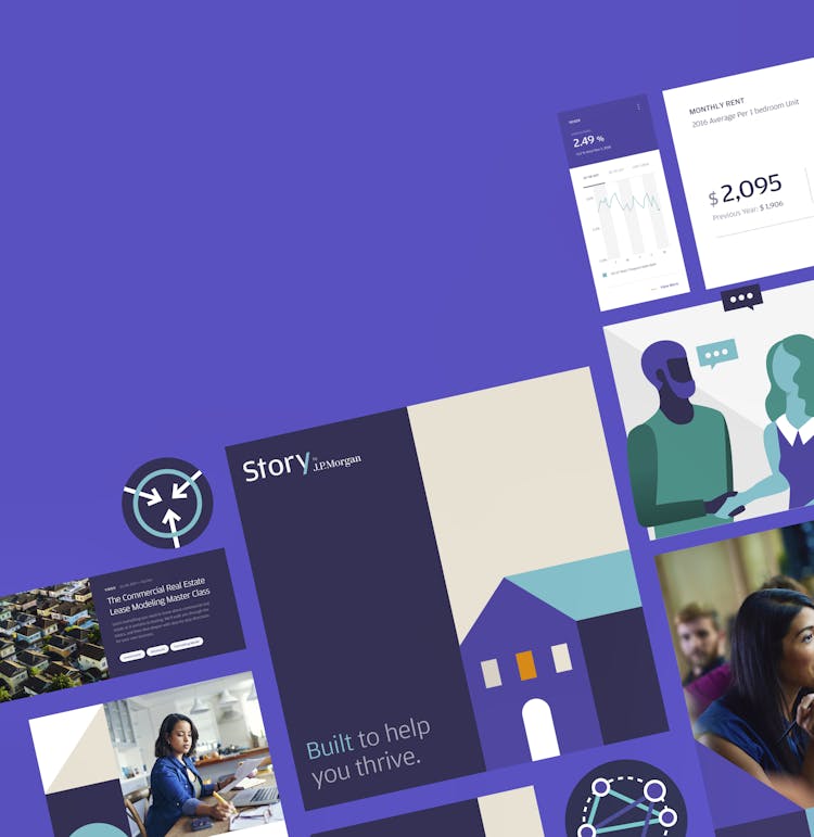
Wealth Management

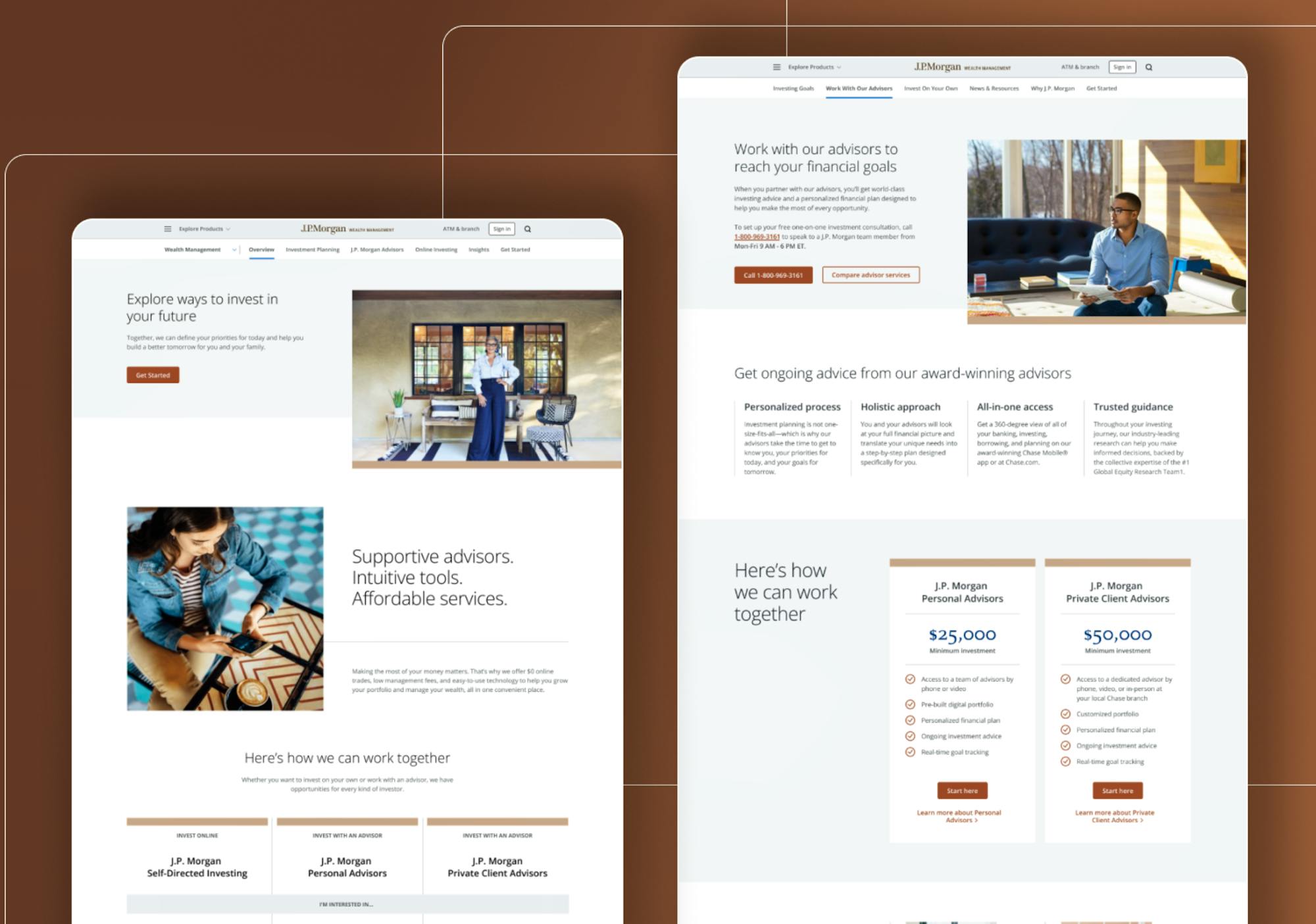
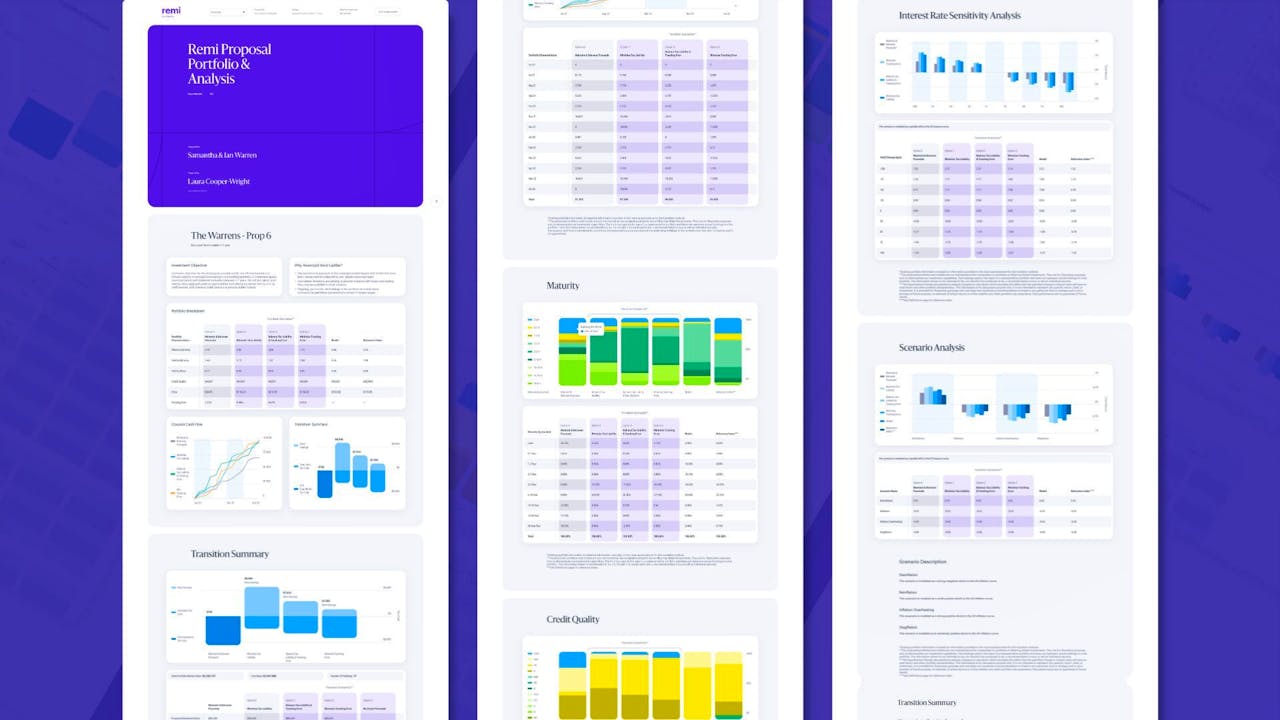
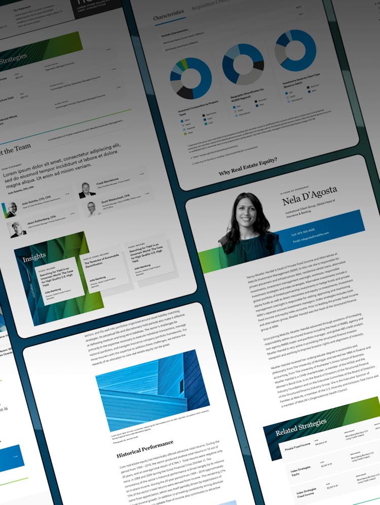
As an extension of our ongoing partnership with JPMC and its brands, JPM tasked us with meaningfully enhancing the performance and functionality of the Wealth Management digital ecosystem. With around $615 billion assets under management, JPM WM is a leader in the private wealth management space, but the site failed to match the brand’s reputation and compete with players in the landscape.
By examining through an ecosystem lens and analyzing the end-to-end consumer journey, we found that audiences experienced JPM WM through a multitude of channels within the JPMC family, fracturing users’ perspective and cannibalizing JPM WM’s brand engagement. When users did find the JPM WM site, content was generic, disorganized, and promotional. JPM WM’s challenge required a holistic solution that orchestrated the experience, ecosystem, audience needs, and brand objectives into a scalable, integrated system.
We architected the new experience for seamless pathing throughout the ecosystem and the prioritization of investor goals over products on each page, enabling us to drive focused engagement and conversion for JPM WM. Our three-phased approach to scaling the experience meant that we could deliver new page templates, features, and functionality that add value at each step along the way, while remaining agile to make improvements based on learnings.
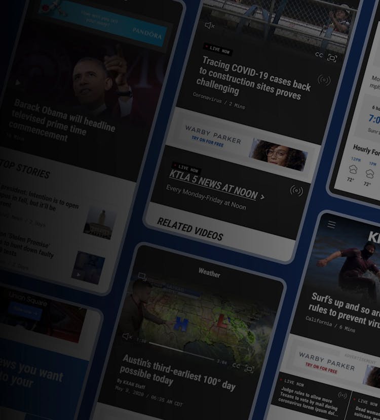
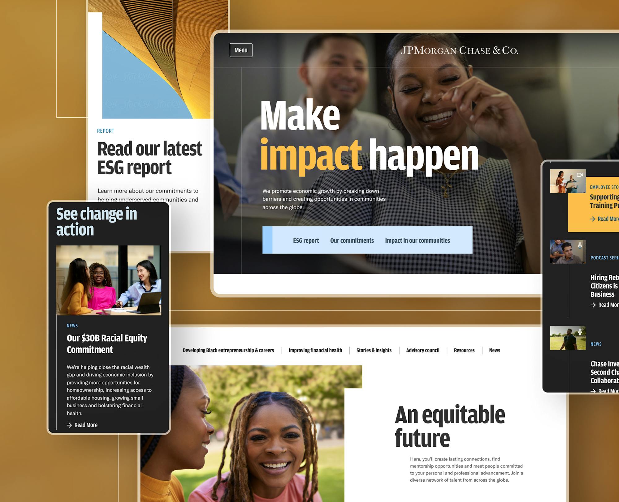
Chase Security Center Hub & Chase Mobile App Adoption
Chase prompted us for a perspective on evolving their consumer-facing Security Center experience and Chase Mobile® app pages. Chase serves half of all US households (over 66 million) and is the number one credit card issuer based on sales and the most visited online banking portal in the US. The existing Security Center struggled to be the reliable, rapid-response, and front-line resource customers need when reacting to fraud. In-depth SEO analysis surfaced key patterns users were taking during moments of high anxiety if they had experienced suspicious activity. A disjointed web of pages was reimagined into a clear and helpful experience for users and their caretakers that provides education, information, and resources. Looking ahead, it can scale with content needs and become a core resource for Chase’s customers and team.
For the Chase Mobile® app’s public-facing pages, the experience was disjointed and designs outdated. Chase’s objectives of encouraging mobile app adoption and educating customers were top of mind when refreshing their pages and modules. New QR code and deep linking functionality along with contemporary product UI creative was introduced into their design system, balancing interactivity with accessibility.

We discovered through stakeholder conversations and research that the experiences had overlap, with mutual themes of connectivity and security. To ensure the experiences told a united story while meeting their independent objectives, we designed them in parallel to one another. Chase’s new mobile banking pages focus on succinctly introducing the feature and its benefits while offering multiple CTAs to enhance conversion. The Security Center experience includes a new site architecture, taxonomy, navigation, and page narratives that guide users to action, encourage learning about prevention and the latest scams, and instill a sense of control to lower anxiety.
jpmorgan.com
J.P. Morgan is renowned for its expertise, client service, breadth of offerings, and reputation as a partner across industries, yet the site underdelivered in demonstrating these attributes. We partnered with JP Morgan to re-architect their web presence and harmonize the experience with its business and audience objectives.
We identified the primary tasks the site needed to help users accomplish by leveraging a data-driven approach involving search analytics, user behavior, and journey mapping. Our research enabled us to establish three key experience pillars for the new JPM site – Universal Findability, Personalized Connection, and Expertise Through Proof – and for us to understand that users view content on JPM.com through three primary contexts – Solution, Growth Stage, or Industry.
The experience we designed (launching in 2023) takes an incredibly circuitous reflection of corporate structure and transforms it into a guided editorial experience that bridges the gap between prospect and client experience. The deep design system unifies all J.P. Morgan lines of business, bringing a publisher’s toolkit to marquee publications like market outlooks. Since users return to this content through repeat visits, we designed each piece of content to be shareable and interactive at each chapter, and for format-bending flexibility that allows different team members to view the content in executive summary and long-form, online and off.