The Los Angeles Times Makeover
The Los Angeles Times has been Southern California’s leading source of news and information for more than 130 years. It has won 41 Pulitzer Prizes and is read and revered worldwide.
The Times has established itself as a major player in the digital news landscape and, in 2012, recognized that more people were consuming latimes.com on mobile than ever before. At that juncture, it sought out a partner with an expertise in responsive design. Its quest, in large part, was to stimulate its thinking about how design and technology can work together to best engage contemporary audiences and serve advertisers.
And that’s where we came in.
1
The Embed
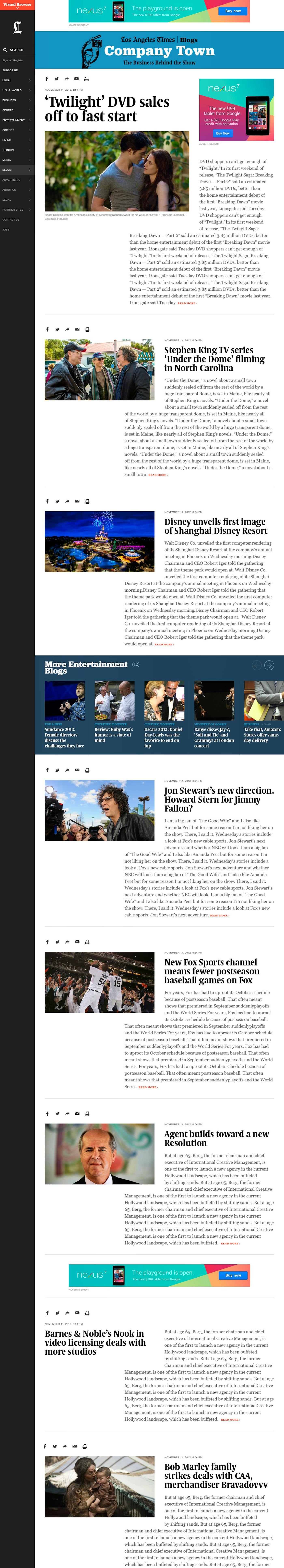
We undertook a collaborative process to completely overhaul latimes.com. This required a critical look at how The Times had previously presented its journalism and advertising digitally—and a protection of the brand’s essence and values.
We started with the journalism. We embedded ourselves in the newsroom to better understand how LA Times operates, finding out what types of stories are written (breaking news, long form, photo journalism, etc.), how stories break and build, what tools are needed given the depth and breadth of multimedia content being produced, how conversations are best sparked, and the role The Times plays in the lives of Californians and readers around the world. We dug into everything.
We then listened to the company’s business objectives, which were to increase traffic and better engage its readers, differentiate its coverage and inspire reader loyalty, assist its advertisers in breaking through digital clutter or reach audiences in new and innovative ways, tap inventive design solutions for delineating native and sponsored content, and improve and enhance latimes.com’s membership funnel and e-commerce efforts.
2
The Outcome
The team landed on four core features that would set the tone for the new latimes.com:

— 01
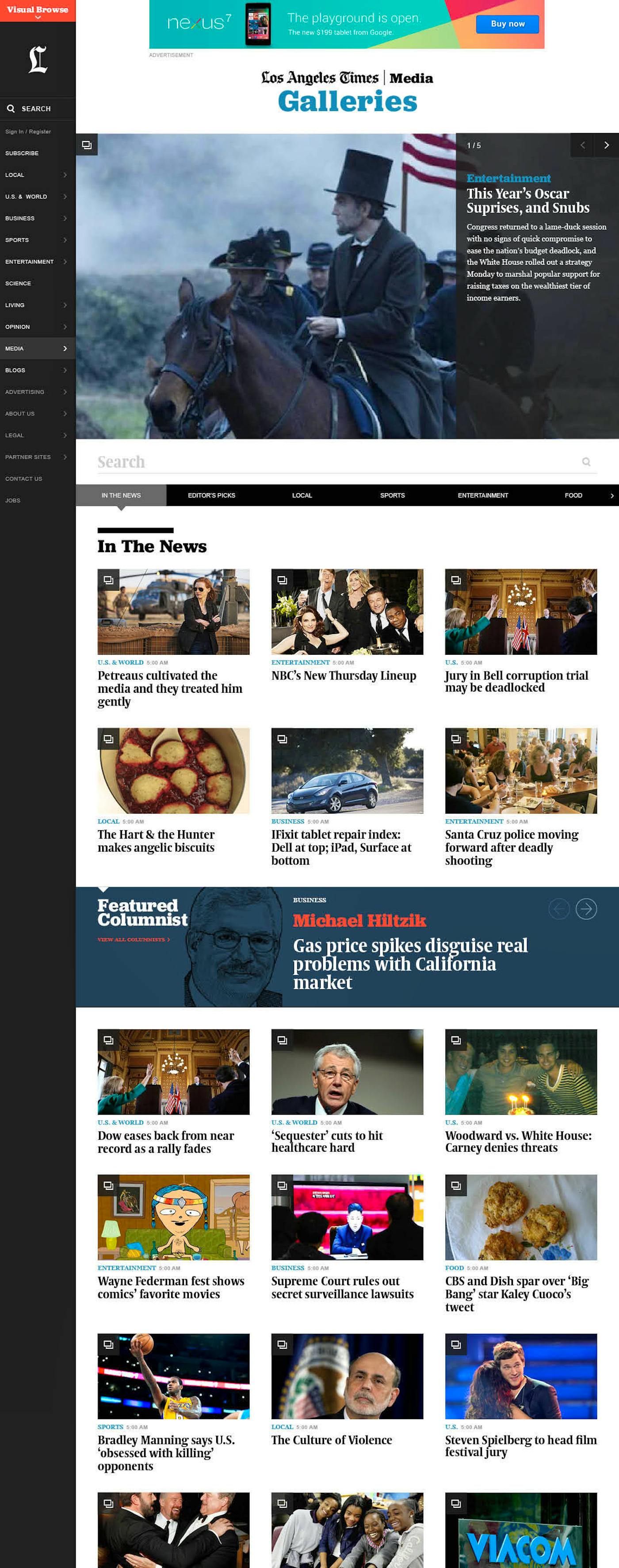
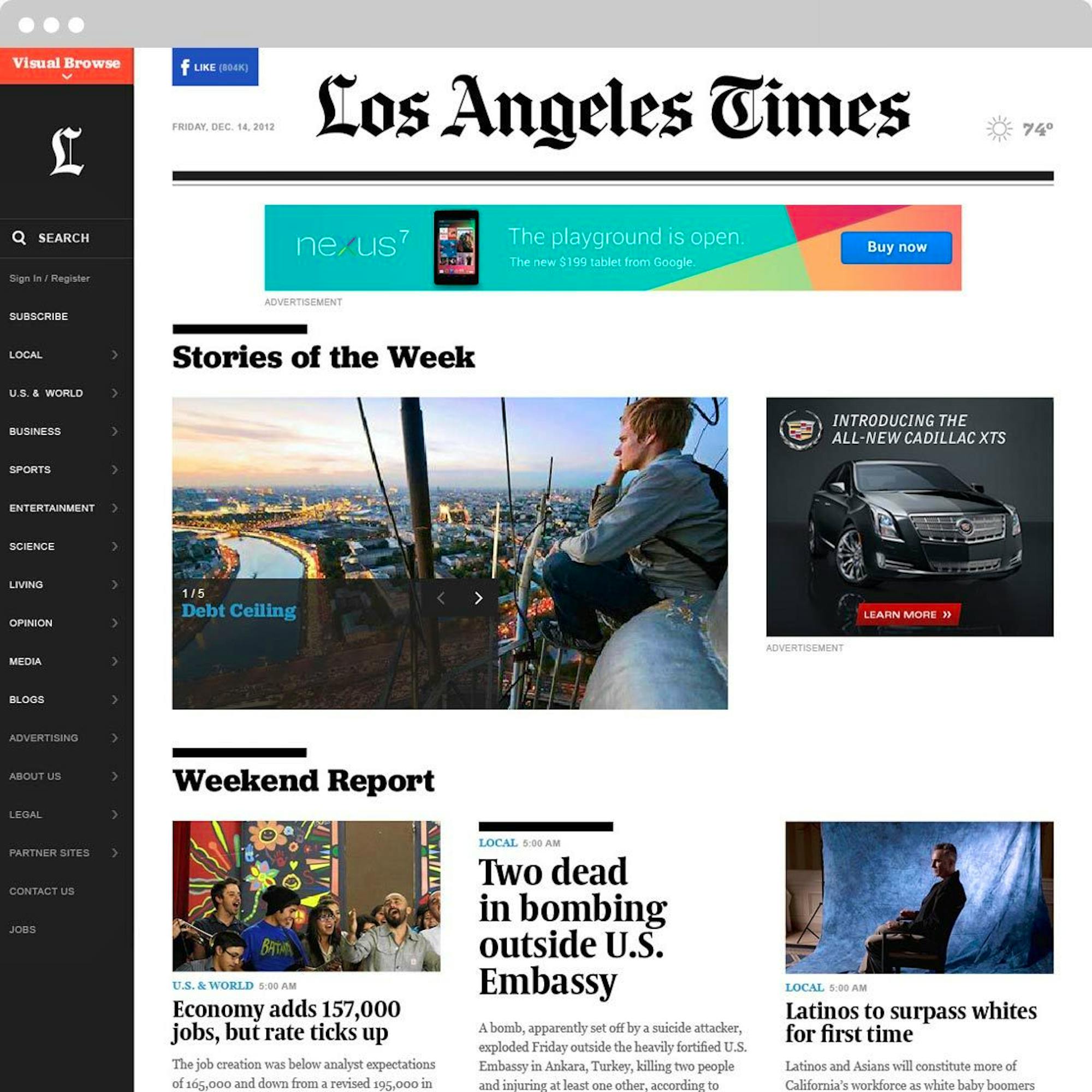
Visual Browsing
This feature is anchored at the top of latimes.com, providing a photo-centric, section-level way to discover new content.

— 02
Transporter Feature
Introduces a way to seamlessly path users from one section or piece of content to the next. Section fronts and article pages are anchored by a row of thumbnails, allowing readers to easily discover additional content.
— 03
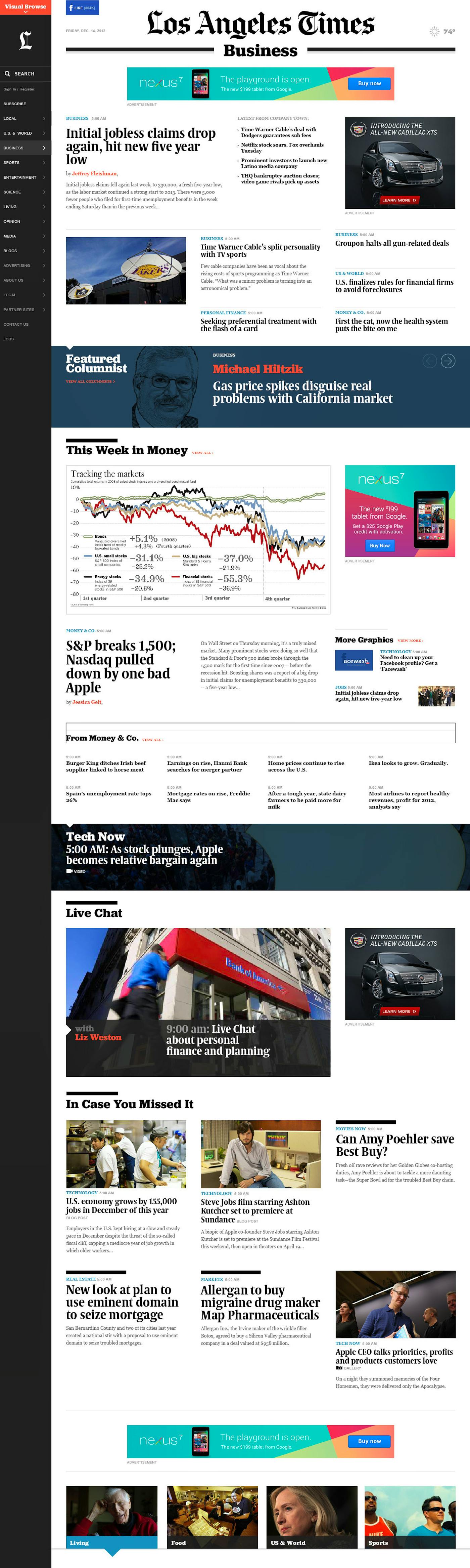
Flexible News Packages
The homepage and all section fronts were designed in a flexible format to accommodate the ever-changing flow of news. No page looks like a static template, and content can be promoted in ways that reinforce its value. In other words, the visual treatment of the story matches its editorial importance.

— 04
Article Pages and Panels
Each article page is an ecosystem, bringing stories to life with related video, photos, and story links embedded within—as well as slide-out panels to offer further content discovery and commenting. The design recognizes how readers search for news by treating article pages as entry points that are as valuable as the homepage.
3
The Impact
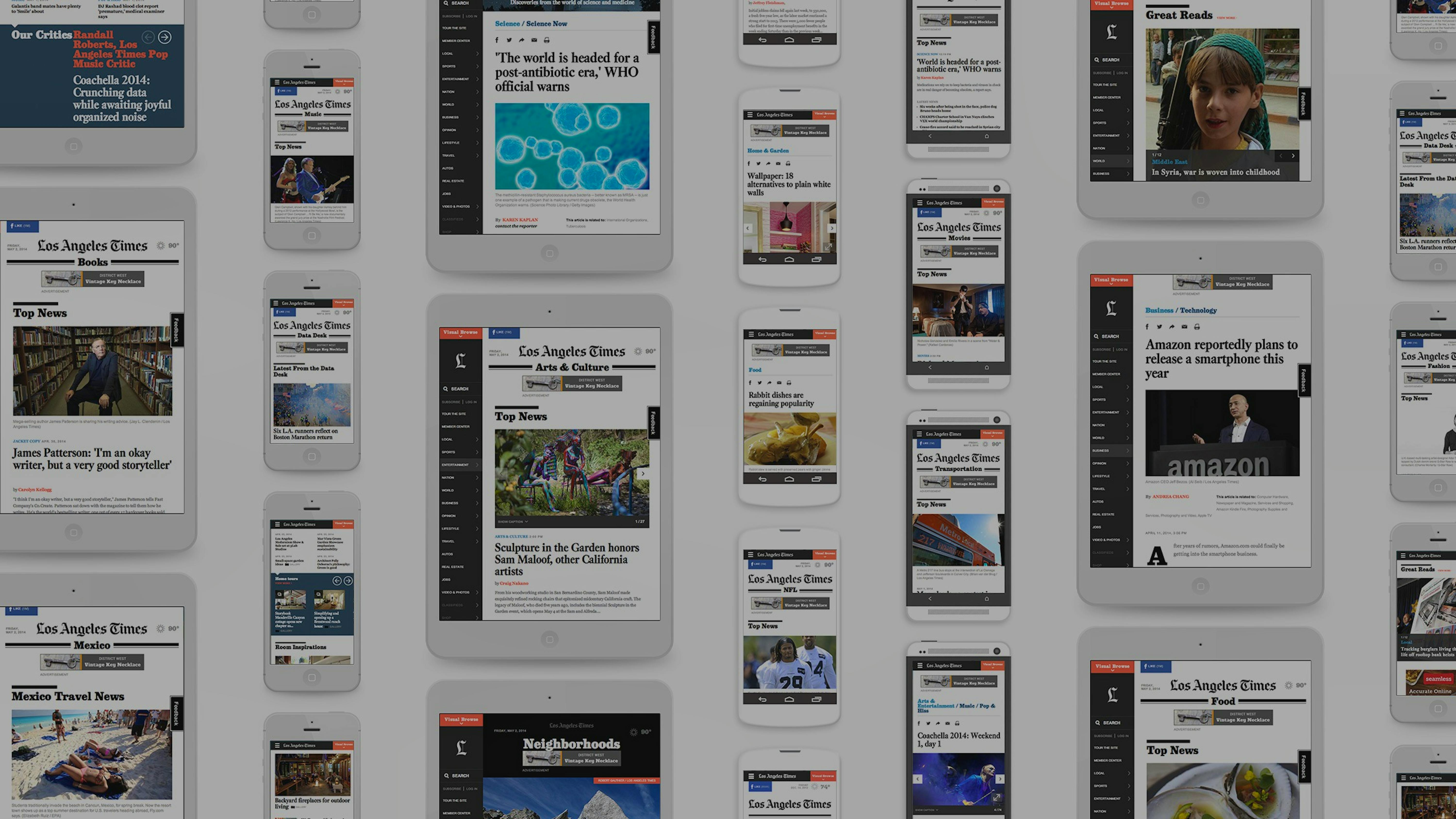
The new latimes.com is one of the world’s largest responsive news websites ever built. This means that all readers on all devices and screen sizes get the same world-class experience.
It’s a bold and visually-striking new design that disrupts the traditional page grid and highlights LA Times' marquee journalism. By eliminating clutter, the site puts the focus on its unique voices and multimedia.
Latimes.com has now introduced a new standard for digital news delivery. It's a rich, dynamic showcase for storytelling in all its forms and an exceptional platform for advertisers.