
The Huffington Post
In 2015, Arianna Huffington's year-end memo to her staff offered some ambitious plans. On the content side, she announced two new international editions: HuffPost Arabic and HuffPost Australia. On the design side, meanwhile, something even more exciting was brewing:
The 10-year old news organization announced that it had partnered with Code and Theory on its first major redesign.
Around the same time Huffington circulated the memo, a team of visual and UX designers, content strategists, and producers from Code and Theory were taking a first pass at website prototypes and initial design concepts.
Some five months later, the first manifestation of the complete redesign—the mobile website—was unveiled to coincide with HuffPost’s tenth birthday.


Mobile is the future, and the future is happening now.
The mobile site is the just first phase of Huffington Post’s first-ever site-wide redesign, which will roll out in the coming weeks and months.
In its entirety, this project was about re-thinking how one of the web’s earliest digital-first news sites publishes news, and how to deliver a platform that could continue to grow with HuffPost’s rapid global expansion.
This is how we approached the challenge.
1
Encouraging Diversity
The mobile site’s design was informed by the fact that people consume news differently on a mobile device than on desktop.
They often enter news sites via search engines, links from emails or text messages, or through social media. With so many visitors entering through the “side door,” a major goal of the redesign was to find ways to encourage every visitor to stick around and explore more.
“Every article now acts as a gateway to the rest of the site,” says Jordan Jayson, The Huffington Post’s VP of Brand Strategy and Development. “We're treating every page like a front page, giving readers more opportunities to find relevant and interesting HuffPost content from the mobile web article itself through infinite scroll, related content and personalized recommendations.”
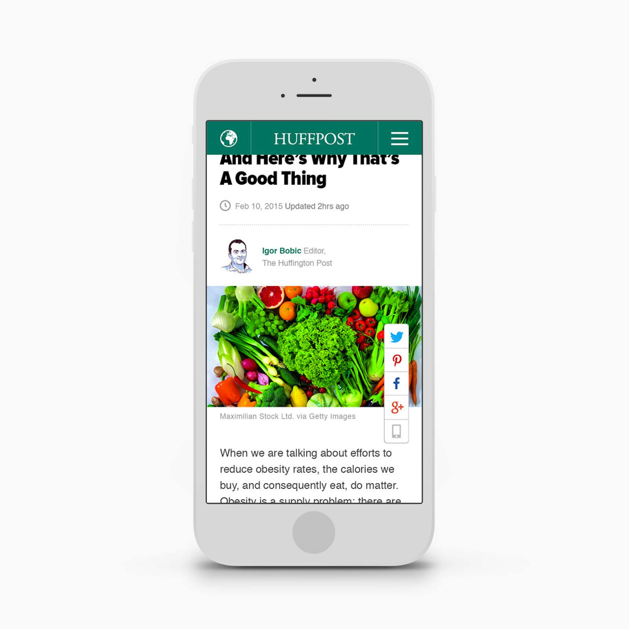
One interesting feature is the Article Summary Package, which was specifically designed to only show the first three paragraphs of a story with a prompt to "Read More." The idea is to give visitors the option of reading the story that brought them to the website in the first place, or check out related stories that might be of interest.
“We realized early on that people were reading a bit and then jumping around. Giving people the option to read the entire article—or not—lessens the barrier for people to discover more,” says Peter Gallo, a UX director at Code and Theory. “We saw a pattern in behavior and mapped a solution to address the problem.”

2
Micro-Content is Huge
A big idea behind the redesigned mobile site was to give visitors more opportunities to share all parts of a story.
It’s why we’ve integrated several features that enable users to share “micro-content,” or parts of an article. While most HuffPost stories are inherently shareable, there’s also an audience for each of the bite-sized segments.
For example:
Quotes
If an interesting pull-quote appears in a story, users can Tweet, post it on Facebook, email it to a friend, or share it via SMS.
Photos
Sometimes a picture says it all. Pressing the share button perfectly formats the photo for each available social platform.
Headlines
Sharing a headline is sometimes the most efficient way to tell a friend about breaking news. No need to highlight, copy and paste—just press share and the work is done for you.
3
Mapping to Mobile Behaviors
The new experience takes into account new behaviors on mobile and maps to how we all like to share, read, browse and search for news content. For example:
Window Pane Mode
Another concession to itinerant habits on mobile is the Window Pane Mode. Currently residing in the top right corner, the feature lets you look into different categories without navigating away from the page you’re on, giving readers a snapshot of the top news stories within just a few seconds.

4
Just the Beginning
The re-launch of The Huffington Post was a continuous and iterative process, which is a testament to the startup-like vibe of the organization.
To that end, the entire Huffington Post organization committed to better understanding how changes in search behavior and content consumption, technology, and social influence impact the way users interact with HuffPost.