The Globe and Mail Adopts a Responsive Philosophy
The most read newspaper in Canada, The Globe and Mail is a global brand. It is revered and respected worldwide, and attracts more than 6 million unique visitors every month to its digital platforms.
In late 2014, the publication called on Code and Theory to help them create and execute on a new vision for their digital product suite.
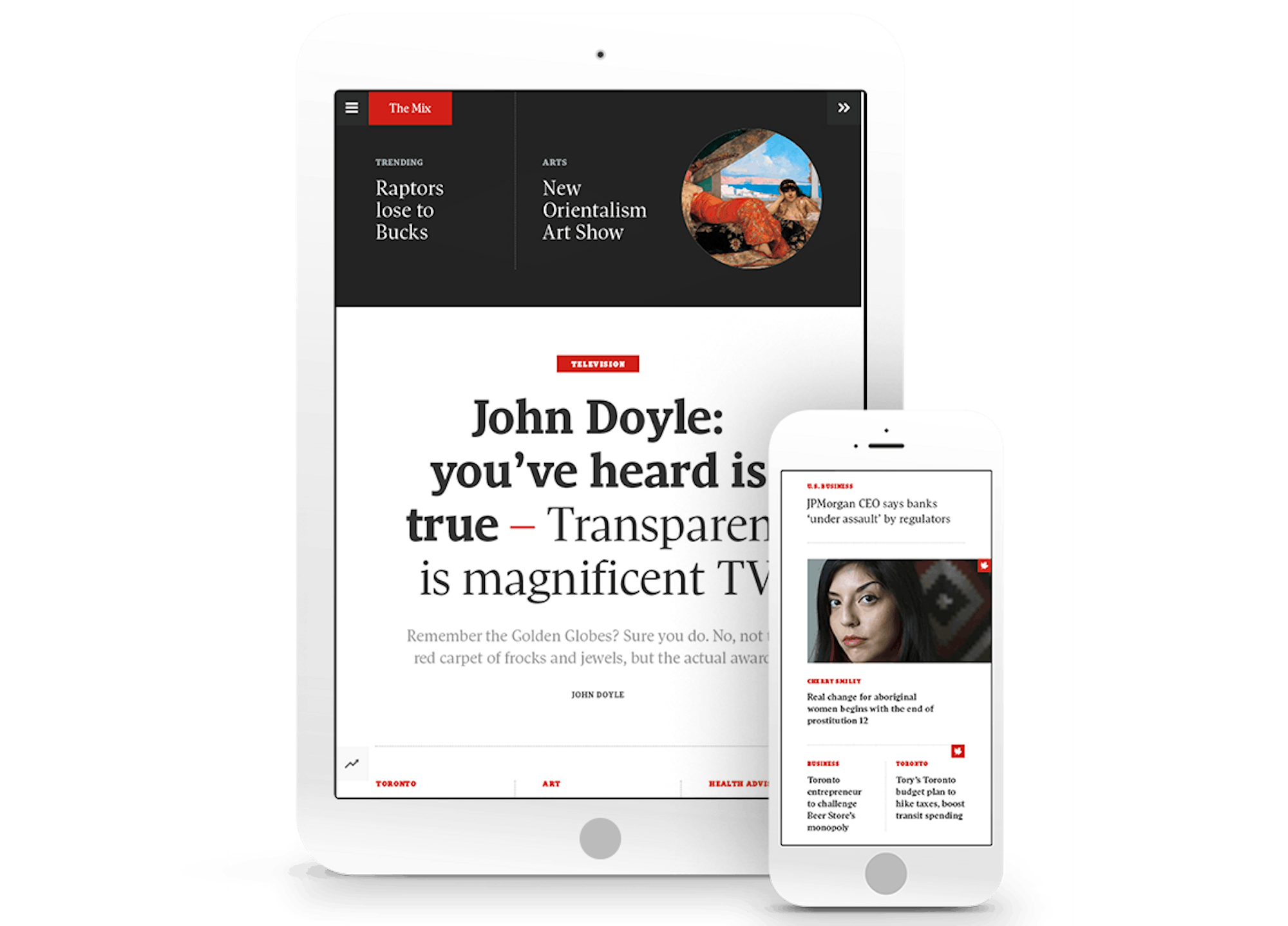
Rather than doing a single wholesale change, The Globe and Mail started with its iPhone and iPad apps. Typically, when news organizations move to a responsive platform, they begin with the browser. In tackling its native apps first, The Globe and Mail had committed to applying a more seamless, responsive philosophy across every platform, and investing in a single editorial workflow.


1
Embedded in the Newsroom
Before any concepting began, Code and Theory embedded themselves in the publication’s Toronto newsroom.
During that discovery period, Code and Theory met with stakeholders from every department and identified three primary segments of Globe and Mail readers:
Market Watchers: The readers who use The Globe and Mail to find actionable financial news and data.
Upward Urbanites: Those who seek out information that will help them stay in-the-know about news and players in a particular industry.
Digital Information Seekers: A group that come in through social networks, particularly Facebook and Twitter, who are likely to share an interesting story.
2
A Design That Speaks for Itself
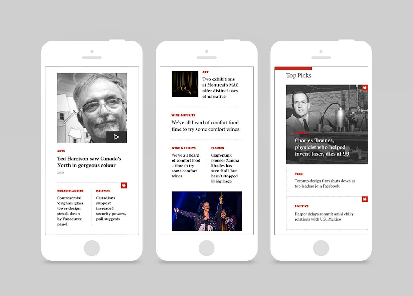
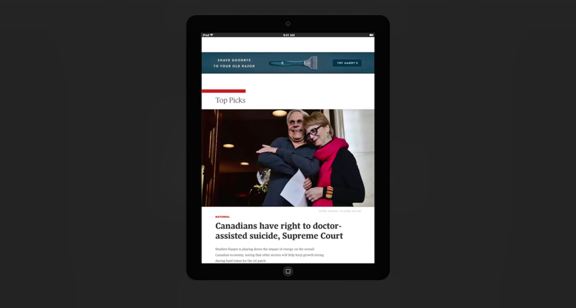
Some traditional news organizations don't the opportunity to let design present a clear narrative to their readers. They’ll typically rely on posting an endless list of stories and headlines, forcing the user to decide what's important and what’s not.
In redesigning its apps, Code and Theory worked with The Globe and Mail to create a much more captivating experience—one that would convey a purposeful narrative through color, contrast, density of content, and even motion.
“We thought, ‘What if the apps were seen not as just a vehicle for disseminating content, but a powerful tool to enable readers to get the information they need, at the right moment, in the right context?’” - Code and Theory Creative Strategy Director Matthieu Mingasson.
Finite but Connected
We designed a specific narrative for The Globe and Mail’s audience. We wanted the experience to be perfectly suited to business and thought leadership—a “finite but connected experience” that encourages curiosity. The idea was to give users a sense of completion, and provide them with the most relevant and insightful stories at any given time.
On the newsroom side, editors are able to prioritize and limit the number of available articles on the app so that the user is presented with a curated reading experience.
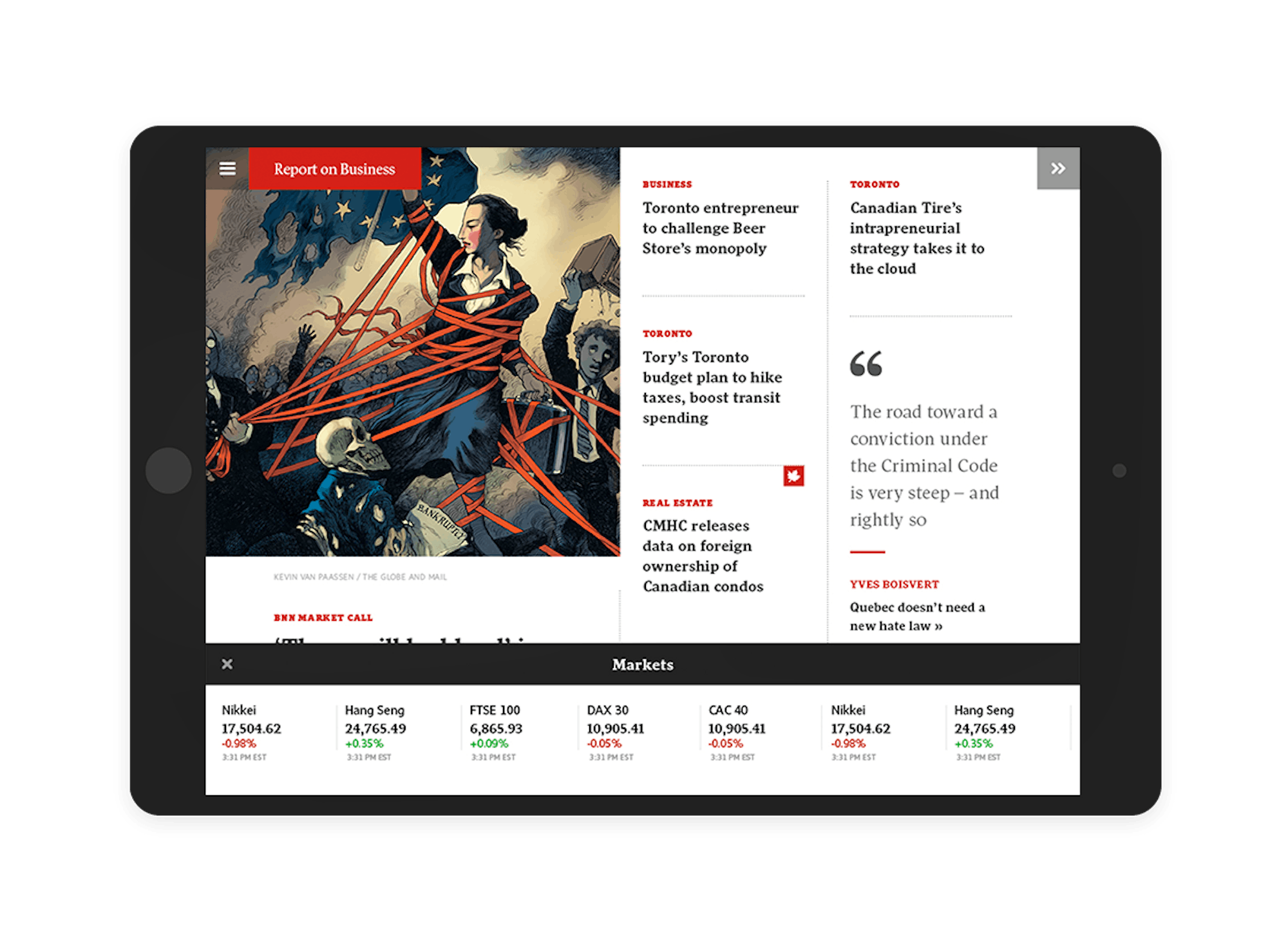
The Report on Business section, for example, gathers up everything the reader needs to know in a compact, business-only package. Editors curated these sections by following two responsive timelines—one for day-parting (e.g., morning, lunchtime, evening, and weekend), and the other for real-time moments (e.g., before market, during market, breaking news, and after-market closing).
A Unique Browsing Experience
The browsing experience is made for tactile devices. It is fast and non-linear. Users can choose to rapidly swipe across each section to quickly grasp what’s important today, or scroll down a specific section to gather more in-depth information about a topic.
Market Data is available transversally at any point of the experience—users can simply tap the always-available Market icon and the information is displayed.
Creating Meaningful Relationships
Readers don’t look to The Globe and Mail as a content distributor, but rather as a trustworthy, reliable source of insight. The added value of modern journalism is to tell readers why a piece of news is important, why it’s relevant, and how it’s connected to the broader news cycle. We designed a personalization strategy for The Globe and Mail to better connect stories for readers, provide more context, and adapt to the user’s own consumption mode.
On the new apps experience, personalized content packages dynamically adjust based on the user’s location, time, choices and preferences overtime.


3
Responsive Content Flow
Responsive design doesn’t just refer to the look and feel of a product—it refers to the entire experience, including editorial workflow.
Code and Theory worked closely with The Globe and Mail as they improved their CMS capabilities and refined editing workflow to improve content distribution.
By applying a responsive approach to design in a native environment, we enabled the system to distribute one single editorial workflow on two different devices, and provide an optimal experience on each.
4
A Focus on Mobile
Not long ago, news apps were seen only as accessories to the main website. With the launch of its iPad and iPhone apps, The Globe and Mail proves it doesn’t see things that way.
The launch represented the first step in the brand's larger commitment to better understand their readers, and offer products that are more beautiful, responsive, and connected.