
Anki.com, Design in Startup Mode

1
Transitioning Anki Drive from Laboratory to Showroom
Anki approached us as a startup in stealth mode with major investment backing. We were excited about the opportunity to craft a website to communicate, sell, and extend the premium Anki product experience.
Best Viewed on Any Device
We worked to create a completely responsive design, optimized for viewing and purchasing on any device. The store itself was built fully responsive, with special attention to tablet devices—a key touchpoint of the target audience.
Set the Stage, Let the Product Put on the Show
The experience of learning about the product needed to be as rich as any of our editorial sites. From the first touchpoint to the last, customers could find out about the product. The site employed best practices, such as single-page checkout and a minimization of clicks from product to purchase. From anywhere on the site, customers can click-to-buy—from homepage to a long-scrolling Anki Drive page, with multiple entry points throughout and a docking global nav that offered a persistent link to the store or checkout.
2
The Store Extended the Product Experience
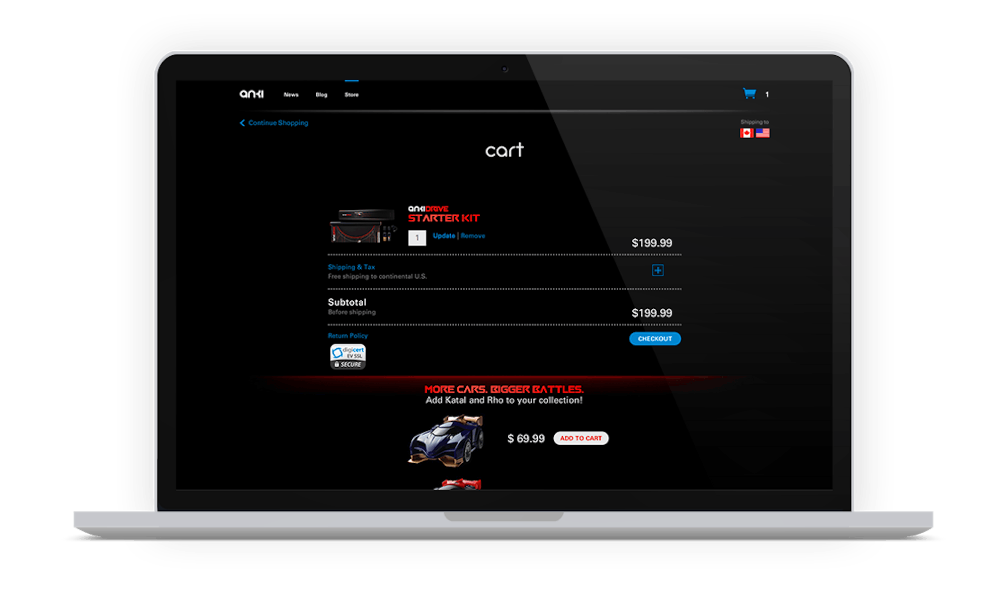
Early on, there was a debate over whether the store should live on a traditional white background or a bold, black background to align with the product aesthetic. Experience consistency won over pattern adhesion. The single-page checkout focused on simplifying what was asked of users in each micro-interaction, through features such as: clear visual hierarchy, form pre-population and in-page refresh.
3
Scroll to Experience, Click to Decide
Much focus was put on the Anki Drive product page in an effort to design the best stage on which to showcase this breakthrough consumer product. We arrived at a strategy of scrolling versus clicking in an effort to minimize the decisions required by the user, while communicating the whole time with continuous visuals. This vision manifested as a tall page filled with full-width imagery and video, introducing the Anki Drive story and ultimately pathing to purchase.

4
Sync, Collaborate, Evolve, Repeat
Part of the fun of working with startups is the ever-evolving product—requirements are always a work in progress and assets are often still in production. As the final touches were being put on the actual Anki Drive product, we pivoted with the development, providing strategic recommendations where product and website overlapped. We took advantage of our shared location in San Francisco to meet in person, sharing designs and white boarding ideas.
Internally, we maintained a close collaboration with a highly iterative process involving UX, Visual, and Tech during the Design and Development phases, keeping an open dialog in order to reach optimal solutions in real-time. We also leveraged category-specific insight from our New York office, working closely across the offices.
Founded by Boris Sofman, Mark Palatucci, and Hanns Tappeiner (3 PhDs from Carnegie Mellon), Anki is an artificial intelligence and robotics company, funded by Andreessen Horowitz, Index Ventures and Two Sigma.
5
Anki Brings Artificial Intelligence to the Masses
What was Anki’s goal? To create an entirely new category of consumer robotics, with Anki Drive as the first manifestation. Anki Drive itself felt like a video game come to life, with the cars taking on the characteristics of video game characters in the physical world. Using an iPhone as a controller, players could race against each other or against the AI cars.
In June 2013, Anki was unveiled to the public during Apple’s WWDC Keynote, at which time the media proclaimed that Anki might be the most advanced intersection of consumer-grade artificial intelligence and robotics ever.