How Visual Storytelling Cuts Through Neverending News Cycles

Using visualizations to make stories feel relatable—in the way a story looks, works, or both—is a powerful storytelling technique that can cut through the noise of the nonstop news cycle. It can make audiences stop in their tracks, catch their breath, and feel the impact of a story.
Read it on

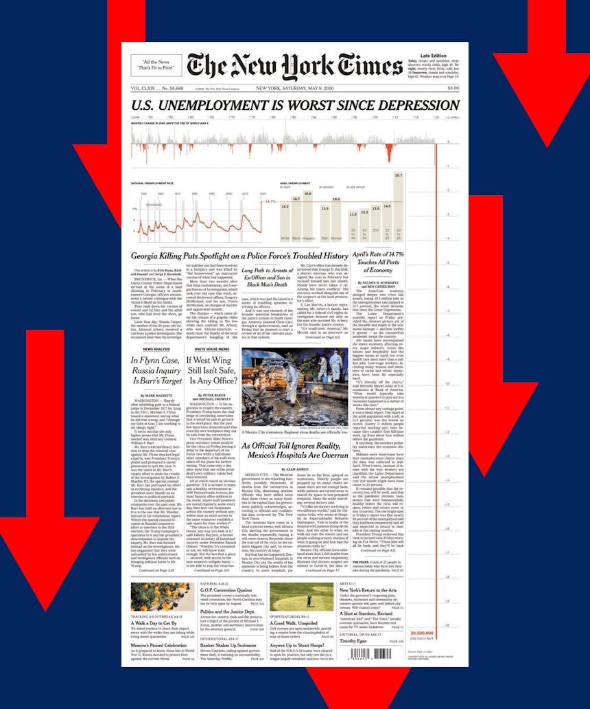
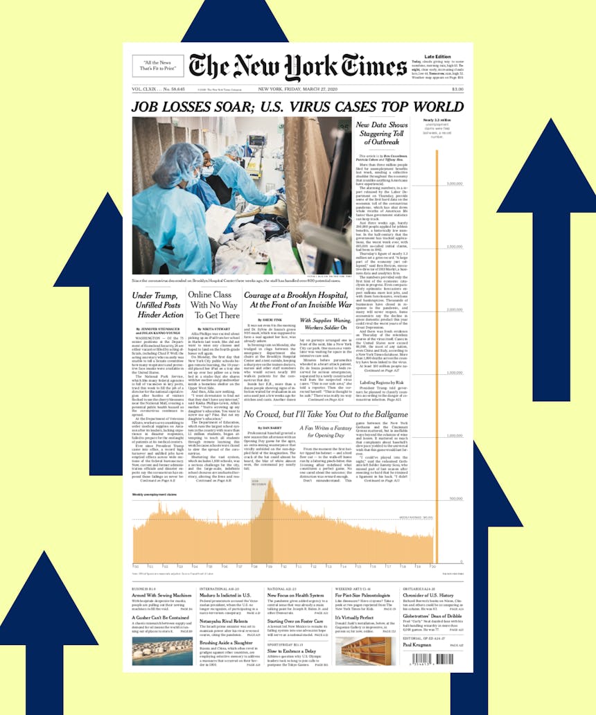
The New York Times decided to literally break the front page (of the physical paper) to emphasize the unemployment crisis that now rivals the Great Depression. The Times subsequently extended this approach to a few digital stories, underscoring that the best design systems can really sing when they are thoughtfully broken. Every time the New York Times publishes a front page like this, as it did on March 27 and May 9, the world stops, if only for a moment, and pays attention.

Read it on
Developer Matt Korostoff's 1 Pixel Wealth visualization went viral last week—but it wasn't because of the content itself. Though the relative wealth of the richest people on earth is well-documented thanks to persistent tools like the Bloomberg Billionaires Index, Korostoff's incisive experience design brings the scale of income inequity off of the screen and into the physical.
As you scroll, you don't see the information in the story—you feel it.

Words by
CREATIVE STRATEGY DIRECTOR
Michael Shane